Bare Dashboard
Helping people in need to manage their loved one's funeral process online in an easy and effective way.

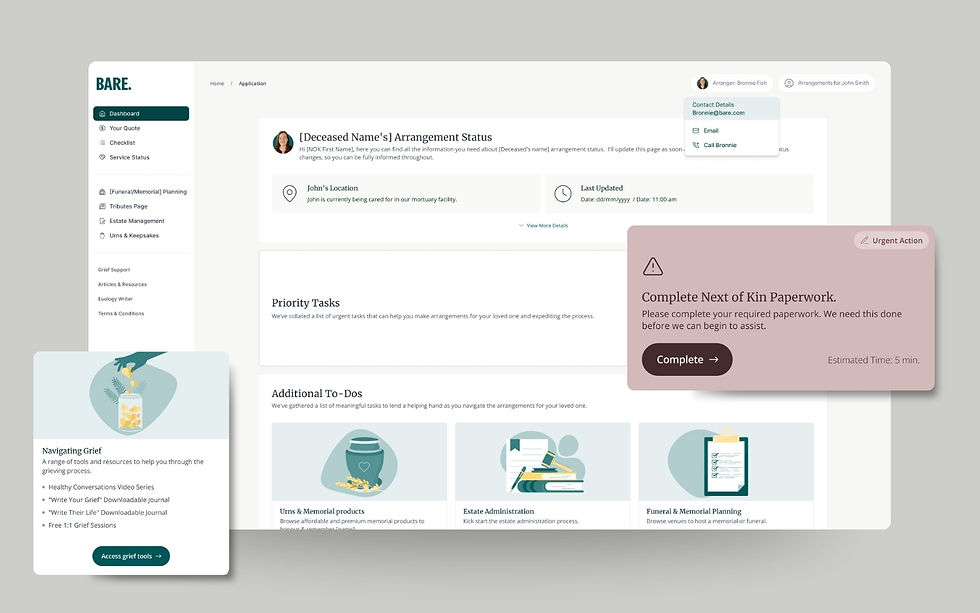
Home of the Bare dashboard. Users land on a greeting section, followed by an urgent task that needs to be completed and a personalised checklist status.
Overview
Bare is one of the largest independent funeral directors in Australia and one of the biggest products it’s a dashboard where people can check the status and manage the funeral of their loved ones online through an intuitive and modern dashboard which I was in charge of designing from scratch. Let's walk through the process and the insights.

Home screen with a priority tasks section and additional to-dos.
The Problem
Bare held more than 7,000 funerals annually and they mostly arrange each funeral and enquiries by phone, which lead in a huge problem as the arrangers answers too many calls per day, which lead the company to create a dashboard to solve questions and check the status of the funeral arrangements online to reduce the volume of the calls per day and keep the user informed about their loved one.
'The Services Planning' page: Steps for planning your own service, including examples of personalised options.
Discover
The main Bare’s users are +50 years old Australians who are making the arrangement for their loved ones' cremations and arrange their own cremation for the future, leaving their kids and relatives without the worry about caring about this process. To get a better understanding of the user needs, the product team has a series of meetings and interviews with a select group of the arrangers who deal with users every day, and who have a better understanding of their pain points and which are the frequent questions made.
The Arrangement Status is a timeline section where users can check the real-time status of their loved one's cremation. This feature has significantly reduced the daily volume of calls from customers inquiring about the status.
Emphasize
Based on interviews and meetings with the arranger team (arrangers who deal with the main user daily) I have created a persona and journey map to better understand the main user and their pain points. This helped me to empathize with the user and keep the focus on the real problem at the moment to choose which features to keep handy and make them pop instead of the ‘nice to have’ features availables.

Tasks like 'Schedule a Call' or 'Prepare Your Documents' were highlighted as key actions for users to complete their cremation booking. Helping users with these steps online provided significant relief for the arrangers.
Ideate
In order to design this dashboard and make it as much intuitive as possible I have made a series of low fidelity and prototypes to test and get feedback from the arrange team and product team.

Project Overview
Prototype
I implemented a designed system using the Atomic Design methodology. To start I build a catalog of tokens such as colours, text styles, icons and grid systems. This provided me with a set of design guidelines that promote consistency through the dashboard. Also I used the brand colours of the company with a longer palette of their gray and charcoal colours to make the dashboard whiter and cleaner.


The Venue Selector section allows users to choose from a range of their favorite venues and view their features and pictures. This replaces the previous process of sending a PDF via email.
The Result
What I have learned with this project is to keep the user and their pain points in mind all the time. It was easy to start thinking about nice features that could be incredible for the user as create their own website for the funeral, or book a photobook with their loved one’s photos, but as they were really nice, the main reason why the user is using the dashboard is to manage their loved one’s funeral and check the status, and complete tasks required to book the cremation, so the nice to have needs to be present but not as relevant as the main tasks. I love the way that we need to prioritize and keep working in order to make people in a difficult moment their life easier.

The Venue Selector section allows users to choose from a range of their favorite venues and view their features and pictures. This replaces the previous process of sending a PDF via email.
Reflections
What I have learned with this project is to keep the user and their pain points in mind all the time. It was easy to start thinking about nice features that could be incredible for the user as create their own website for the funeral, or book a photobook with their loved one’s photos, but as they were really nice, the main reason why the user is using the dashboard is to manage their loved one’s funeral and check the status, and complete tasks required to book the cremation, so the nice to have needs to be present but not as relevant as the main tasks. I love the way that we need to prioritize and keep working in order to make people in a difficult moment their life easier.
